Minimizing unknown unknowns
The bottom line of this blog series is that in order to prioritize effectively, organizations have to have a clear picture of their loss event landscape. Developing a clear and logical taxonomy can be helpful in understanding such a complex landscape and minimizing the odds of overlooking something important but not obvious. (More on this in Unknown Unknowns)
Before I get into the details, I should point out that the examples I’ll be sharing are just that: examples. Your landscape will undoubtedly be different in some fashion, and your taxonomy should reflect those differences. Also, the examples shown here are focused on the cyber risk landscape. The same approach is applicable to the broader operational risk landscape.
Starting simple
We already accomplished the first step in developing a taxonomy of the risk landscape when we drew a distinction between loss event scenarios and control deficiencies. The remainder of this post will focus on a taxonomy for loss event scenarios.
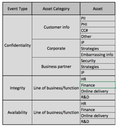
I’ve found that a useful starting point is the age-old information security triad of "Confidentiality, Integrity, Availability". There are other, more complex extensions of this structure, but I haven’t found them to be more effective for this purpose. Let's start developing the taxonomy from this simple initial table.

From here, we typically begin to parse-out the categories of assets at risk. This is where your organizational differences (industry, etc.) would begin to surface.
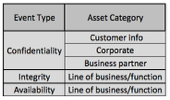
Another layer of abstraction is typically necessary in order to achieve a good balance in terms of granularity. The “assets” at this layer of abstraction can be more detailed information types and/or business functions. Keep in mind that there is indeed a balance to be struck to achieve a level of granularity that is useful. I like to refer to this as a “useful degree of precision”. Not enough granularity means that you’re not likely to gain meaningful insight into the landscape. Too much granularity begins to feel like counting grains of sand on the beach and can become overwhelming.
Including threats…
At this point, I typically like to begin parsing out the threat component of the landscape rather than getting more granular in parsing out assets. Your mileage, of course, may vary.
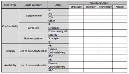
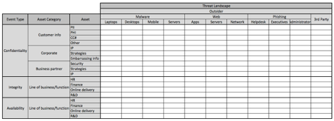
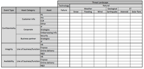
At this point, you can continue to increase granularity in the threat landscape until you reach that balance point of granularity (by the way, “ET” under the natural threat category represents “Extra Terrestrial” events, like solar flares, etc.).
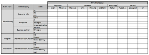
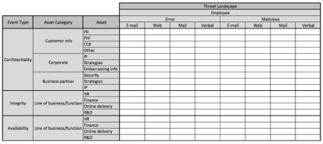
In the images below, I’ve broken out the threat landscape into one additional layer of abstraction. Because the matrix has gotten so large, I’ve broken it up into three separate images. This is about as granular as I recommend going at first, as the matrix quickly explodes in size as you get more granular.
Triage: Identifying what matters
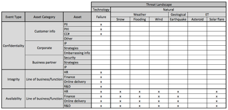
At this point, you begin the process of looking at each cell and asking yourself, “Is this a scenario that’s even relevant to the organization?” I simply place an “x” in the cells that represent relevant scenarios. This will quickly begin to narrow down the number of scenarios that you have to actually evaluate.
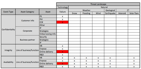
The next step is to do a quick-and-dirty FAIR analysis on each cell with an “x”. These are high-level analyses using the FAIR ontology that are either qualitative in nature or that use predefined quantitative ranges as inputs as in tools like Cyber Risk Triage. You can highlight more scenarios using colors if you like. Typically, each analysis will take from five to twenty minutes to perform. The more of them you do, the faster they become. At this point, you may identify opportunities to shrink the scope of work by combining scenarios that are extremely similar to one another, or parsing a specific scenario into another layer of granularity.
(NOTE: Please let me know in the comments section if you would like to see examples of a triage analysis in an upcoming blog post)
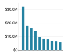
Finally, you perform a full-fledged, quantifiable FAIR analysis on the scenarios that triage has identified as representing the most risk. The results will clearly show which loss event scenarios are most significant to the organization, which can enable your top 10 risks list. Note: the names of the scenarios have been removed from the image because of their length.
The process, particularly the deeper analyses, also represents the first step in developing that second list I mentioned in the earlier posts — the list of control deficiencies. The next post in this series will focus on that list.
Too much work?
Does this process represent a lot of work? Well, yes and no. Yes, it’s certainly more work than throwing a hodgepodge of “risk stuff” on the wall; and no, it doesn’t take a lifetime. For many organizations, this can be accomplished in a matter of a few weeks. The bottom line is that, once the landscape is established in this manner, it’s very easy to maintain it over time, adding or deleting rows or columns (scenarios) as the business/risk landscape changes.
So, this effort should be viewed as an investment that pays big dividends over time in terms of a more clearly defined risk landscape. I would also argue that without this effort, an organization stands a much better chance of overlooking important parts of its risk landscape. This process also improves an organization’s ability to explain/defend the risk management choices it makes.
The next post in the series will discuss the second “top ten” list regarding deficient controls.


