How to Bridge the Gap Between Qualitative and Quantitative Risk Analysis

 All the traditional risk management frameworks use “heat maps” or some variant – a color-coded matrix of “likelihood” against “impact.”
The “quants” in the new generation of risk analysts believe (I plead guilty) that there are much better ways to express risk than the fake math implied by fake-multiplying a subjective likelihood by a subjective impact to get a super-subjective risk level.
Creating Categories with Orders of Magnitude
Yet, like it or not, we live in a world dominated by subjective heat maps, and we must find ways to lead our colleagues to a better way. This article shows two ways to express likelihood and impact objectively and quantitatively. I hope this post can help bridge the gap between the qualitative and quantitative risk management cultures.
Loss Magnitudes
The loss expectancy range can easily vary by a factor of 100, 1,000 or more from the low end to the high end for a single loss scenario. This is just as true of business continuity scenarios as for cyber risk or other kinds of risk analyses. And when you need to compare different scenarios, the range can reach 1,000,000:1 or more. How can the analyst present findings that span such huge ranges to over-busy executives and still avoid biasing the results with their own opinion and dumbing-down?
Here is a nifty and very natural way that I learned from Jack Jones of RiskLens: simply chop the range up logarithmically to get the order of magnitude of the loss. Here is an example taken from one of the FAIR standards:
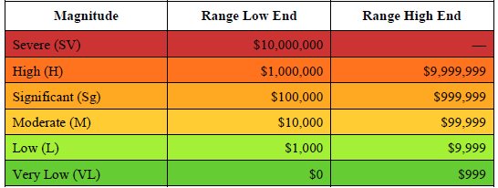
FAIR Standard for Risk Analysis, The Open Group, publication O-RA, p. 21
There is nothing sacred about the words used. You can make up your own. And you can add more categories to go higher or lower in the ranges. If a range is too big, subdivide it further. Or combine them, like the range 0-999 in the table. The key thing is to make it clear that you are using this scheme so your audience knows what you mean by, say, “Significant,” and they know you are using the term objectively, not judgmentally.
Likelihoods
The other dimension in a heat map is likelihood, best understood as the number of times per year an event is expected to happen (loss event frequency), or the probability of it happening in a year. You can get numbers like 0.01 times per year for a magnitude-9 earthquake in my area, or 100 times a year for laptops lost in a big company – again, big ranges. You may see a table that looks like this one:
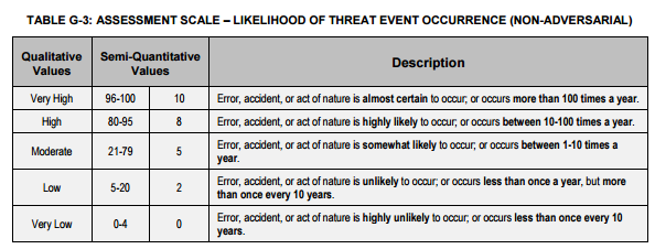
But there is another way which works especially nicely if the probability distribution is lumpy or bell-shaped. In this method we chop up the scale by standard deviations from the mean.
Suppose we are concerned with what FAIR calls the Secondary Loss Event Frequency. This is the probability that a secondary stakeholder group (like customers) will impose a loss on the organization as a result of the primary or initial loss event. If cardholder data is breached, we may have to pay to re-issue cards. The SLEF ranges from 0% to 100%. We can aggregate this range into a few categories which seem to strike the right balance between granularity and digestibility.
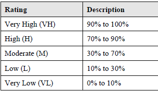
FAIR standard for Risk Analysis, publication O-RA, p. 22
A similar example comes from NIST:

NIST SP 800-30
Where (the heck) did these numbers come from? They look suspiciously like the two- and three-standard deviation points in a table of the normal distribution. The vital feature of both the FAIR and NIST examples is that they map fuzzy language into precise numbers so that it is clear what we mean by “High.”
Communicating to Management
You can use these two methods to help communicate the summary results of a detailed quantitative analysis to executives who have neither the time nor the need to delve into the details, while preserving a crisp trail back to the details and not injecting your own opinion.


